Home/Blog/Iosevka: The Open-Source Monospace Font Redefining Technical Readability for Human and AI Collaboration
virtual coworking
Iosevka: The Open-Source Monospace Font Redefining Technical Readability for Human and AI Collaboration
Iosevka: The Open-Source Monospace Font Redefining Technical Readability for Human and AI Collaboration In the intricate world of technical development, where precision and clarity
15 MIN READ
14 Oct 2026
virtual coworking
Iosevka: The Open-Source Monospace Font Redefining Technical Readability for Human and AI Collaboration
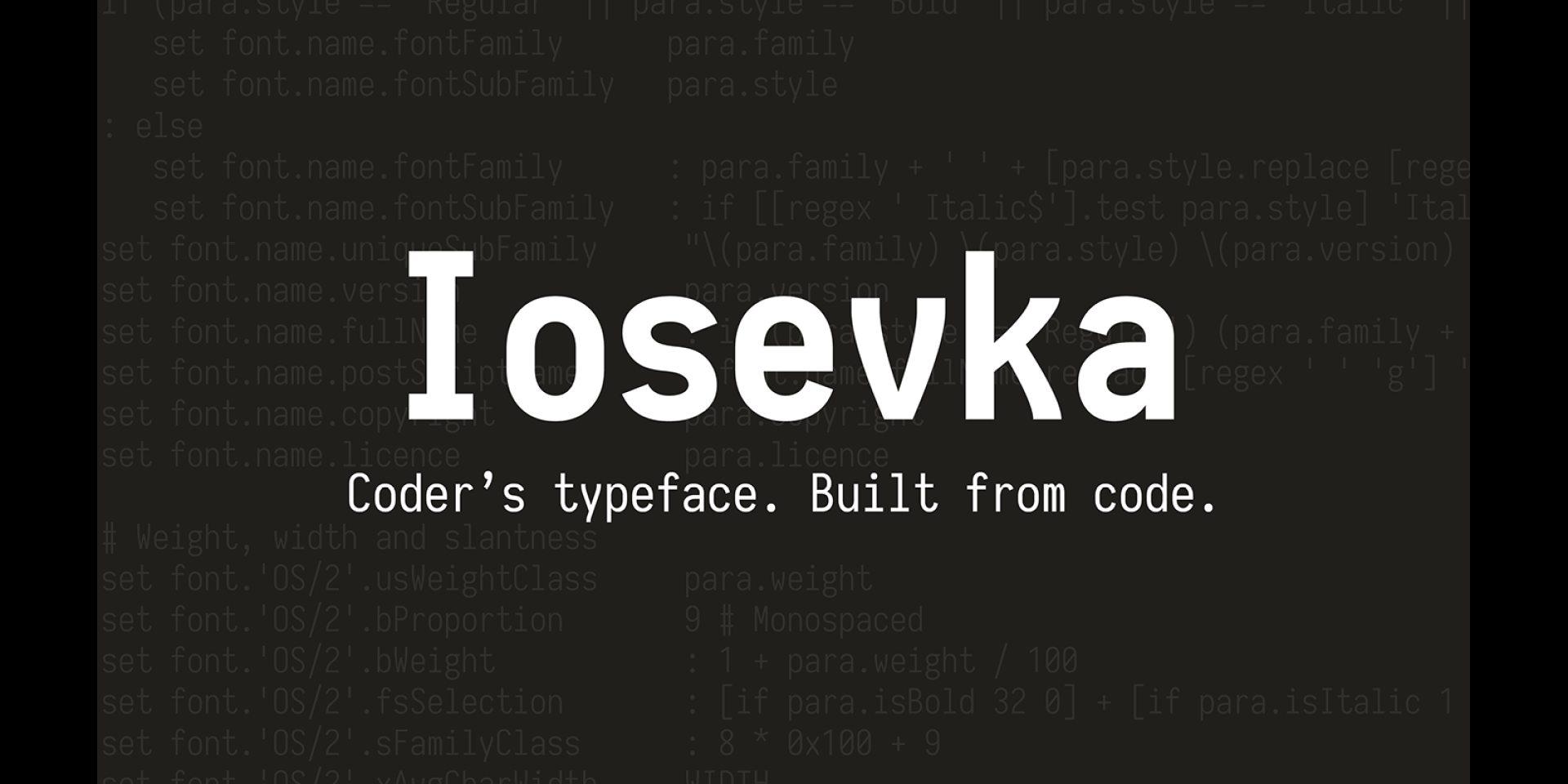
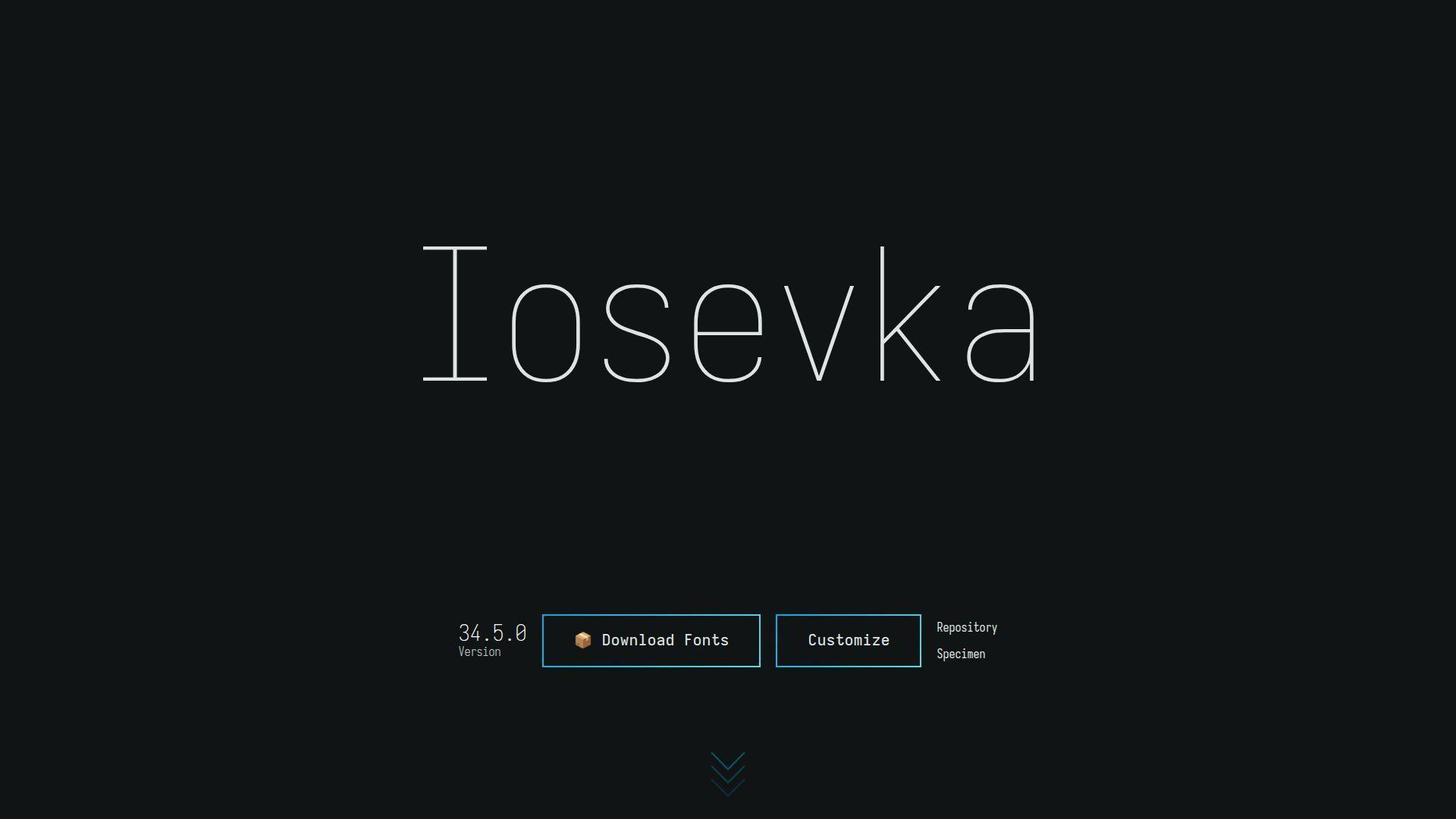
In the intricate world of technical development, where precision and clarity are paramount, the tools we choose profoundly impact efficiency and understanding. Iosevka is an open-source, sans-serif and slab-serif, monospace font that has emerged as a foundational typeface for those who spend their days immersed in code, terminals, and technical documentation. Its unique design philosophy not only caters to the rigorous demands of human developers but also implicitly supports the emergent needs of AI agents interacting with textual data in collaborative environments.
01Beyond Just a Font: A Foundational Tool for Technical Minds
Iosevka stands apart as more than just a typeface; it is a specialized instrument crafted for the technical professional. Defined as an open-source, sans-serif + slab-serif, monospace + quasi‑proportional typeface family, its very architecture is engineered for specific, high-stakes applications. The primary design intent behind Iosevka is clear: it is designed for writing code, using in terminals, and preparing technical documents (Source 1, 2, 4, 5, 6, 7, 8). This focus addresses a critical need for legibility and structural integrity in environments where a misplaced character or an ambiguous symbol can lead to significant errors.
Want your team to run this workflow with AI-native execution?
font’s technical orientation is especially visible in its disciplined rhythm. Every character occupies a predictable horizontal space in its monospace forms, allowing code to line up cleanly in columns. This consistency is useful for indentation, tables, ASCII diagrams, compiler output, and side-by-side comparisons. In a programming environment, alignment is not merely decorative: it helps readers recognize nesting, repeated structures, and relationships between values.
02A Family Designed for Distinction
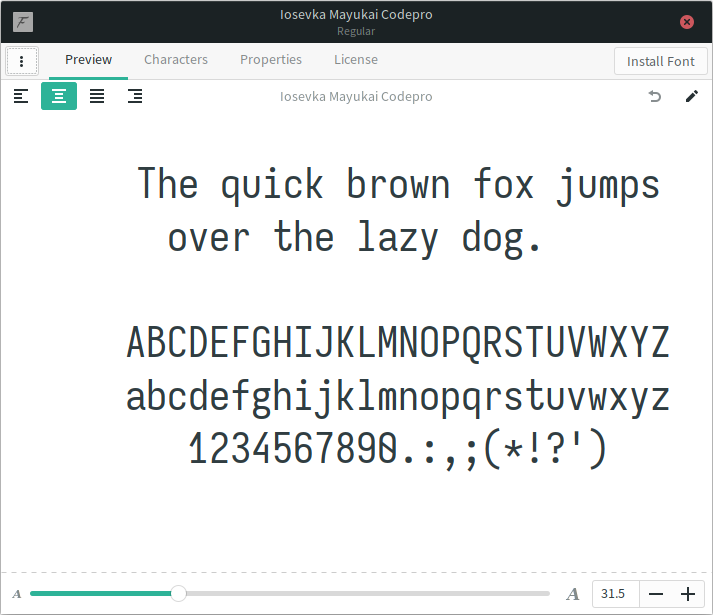
One of Iosevka’s most important goals is character disambiguation. Source code frequently places visually similar symbols next to one another: 0 and O, 1 and l, lowercase i, uppercase I, and punctuation such as ,, ., :, and ;. A typeface intended for programming must make these distinctions apparent without forcing the reader to inspect every character individually.
Iosevka addresses this through carefully considered glyph shapes and spacing. The exact appearance depends on the selected variant and stylistic options, but the broader principle remains consistent: characters should be recognizable both in isolation and within dense lines of text. This matters in languages and tools where a single glyph can alter behavior. Confusing a quotation mark with a typographic alternative, overlooking a period, or misreading a zero as an uppercase letter can produce mistakes that are difficult to diagnose.
The same concern applies to operators. Programming languages use combinations such as !=, ==, ===, =>, ->, <=, >=, &&, ||, and ::. Iosevka’s compact forms are intended to preserve the identity of each component while maintaining a coherent visual texture. Developers can therefore scan an expression as a meaningful structure rather than as an undifferentiated row of marks.
03Monospace and Quasi-Proportional Options
Traditional monospace fonts give every character the same advance width. This is ideal for source code because indentation and vertical alignment remain stable. Iosevka also offers quasi-proportional styles, commonly associated with its Etoile variants. These retain a technical character while allowing some glyphs to use different widths.
A quasi-proportional design can be appealing for prose, documentation, user interfaces, and command-line applications where strict column alignment is less important. It reduces the visual space occupied by narrow letters and can make paragraphs feel less mechanical. The result sits between a conventional proportional sans serif and a rigid coding font.
This distinction makes Iosevka suitable for more than one stage of a technical workflow. A developer might use a monospace variant in an editor, a quasi-proportional variant in a documentation system, and a slab-serif variant for a different visual hierarchy. Because these designs belong to the same family, changing context does not require abandoning the typeface’s overall identity.
04Sans Serif and Slab Serif Characters
Iosevka is commonly described as supporting both sans-serif and slab-serif approaches. The sans-serif forms offer a clean, compact appearance that works well in terminals and modern code editors. They tend to recede visually, allowing syntax highlighting, indentation, and interface elements to provide much of the structure.
Slab-serif variants introduce small, block-like serifs to selected glyphs. These serifs can improve horizontal flow in longer passages and give documentation a more deliberate, editorial feel. They also provide another way to distinguish characters without making them overly ornate. In technical settings, the purpose of the serif is not decoration for its own sake; it is an additional visual cue.
The choice between the two is largely a matter of environment and preference. A programmer who favors dense, minimal interfaces may prefer a compact sans-serif style. Someone who reads substantial amounts of plain-text documentation may find a slab-serif option more comfortable. Neither choice is universally correct, and the availability of related designs makes experimentation practical.
05Extensive Customization
A defining feature of Iosevka is its customization system. Instead of treating the published font files as the only possible outcomes, the project provides a way to build variants with selected characters, weights, widths, slopes, and stylistic forms. This is particularly valuable because programming fonts are used in highly personal environments. Developers spend many hours looking at their editor, and small preferences can have a substantial effect on comfort.
Character shapes for letters, numerals, and punctuation
Alternate forms for symbols and operators
Serif or sans-serif presentation
Regular, italic, and oblique styles
Multiple font weights
Condensed, normal, or wider widths
Monospaced or quasi-proportional arrangements
Language and script coverage appropriate to a project
The project’s build process is intended for users who want a tailored result rather than a one-size-fits-all font. Configuration is generally expressed through a build configuration, after which the font is generated using the project’s documented tooling. The exact commands and available options can change between releases, so users should consult the current Iosevka documentation before building.
This model also has a practical advantage for organizations. A team can define a shared configuration that reflects its coding standards and distribute the resulting font internally. A consistent typeface does not replace code review or linting, but it can make shared examples, terminal recordings, and internal documentation feel more coherent.
06Weight, Width, and Display Context
Iosevka’s range of weights and widths allows it to adapt to different screens and viewing conditions. A lighter weight may look elegant on a high-resolution display, while a regular or medium weight can remain clearer on a lower-quality panel. Heavier styles may be useful for headings, interface labels, or presentations.
Width is equally important. A condensed font allows more source code to fit across a narrow editor window. This can reduce horizontal scrolling, particularly when working with deeply nested code, long URLs, structured data, or log output. However, extreme condensation can reduce comfort if characters become too tightly packed. A wider style may be preferable for long reading sessions or large monitors.
Font rendering also depends on the operating system, browser, terminal emulator, editor, and display. The same Iosevka variant can appear subtly different across platforms because of antialiasing, hinting, scaling, and fallback behavior. Evaluating a font with representative material is therefore more reliable than judging it from a short specimen. Useful test content includes code, comments, numbers, punctuation-heavy expressions, and the languages used most often by the reader.
07Italics, Comments, and Semantic Emphasis
Programming fonts must handle more than upright identifiers. Italics and obliques are often used for comments, documentation strings, keywords, or emphasis in technical prose. Iosevka includes styles that can provide contrast while preserving the family’s overall proportions.
A well-designed italic can help separate commentary from executable code without making comments difficult to read. This is useful in editors where syntax colors may be limited, disabled, or rendered poorly by a theme. In documentation, italic text can distinguish terminology or explanatory notes from examples.
The ideal choice depends on how much visual variation a user wants. Some developers prefer a restrained oblique that preserves the structure of the upright form. Others favor a more traditionally cursive italic. Iosevka’s stylistic flexibility makes it possible to select an approach that fits the surrounding editor theme.
08Ligatures and the Question of Transparency
Ligatures combine two or more characters into a single visual form. In programming fonts, they may change the appearance of sequences such as arrows, comparisons, or repeated operators. Support for programming ligatures is a frequent topic of debate.
Supporters argue that ligatures help readers recognize common operators as units. An arrow such as -> can look more like a single conceptual object, and a sequence such as >= may become easier to scan. Critics prefer each source character to remain visibly separate, especially when debugging, teaching, or comparing text literally.
Iosevka can be used in configurations that provide alternate symbol presentations, but the choice should be made carefully. Ligatures do not change the underlying text, yet they can affect how quickly a reader maps the display back to the source. Teams may want to agree on whether ligatures are acceptable in shared environments, particularly when screenshots and code examples are used for instruction.
09Installation and Everyday Use
For many users, the simplest approach is to install a prebuilt release and select the desired font in an editor or terminal. Iosevka releases commonly include different families or variants, so it is important to identify whether the chosen file is intended for strict monospace use, quasi-proportional text, a sans-serif design, or a slab-serif design.
After installation, the font can typically be selected in applications such as:
Code editors and integrated development environments
Terminal emulators
Markdown and plain-text editors
Documentation and publishing tools
Programming notebooks
Version-control interfaces
Web development environments
When configuring an editor, users should check both the font family and fallback list. A fallback font may be used for characters not covered by the primary font, especially when working with multiple writing systems, mathematical notation, emoji, or specialized symbols. A carefully chosen fallback prevents unexpected changes in line height and visual weight.
For web projects, licensing and distribution requirements should be reviewed before embedding font files. Open-source availability does not mean that every use is exempt from attribution or license obligations. The project’s current license and release documentation should be treated as the authoritative source.
10Iosevka in Documentation and Technical Publishing
Although Iosevka is strongly associated with code, its design also suits technical documentation. Documentation frequently moves between paragraphs, inline code, block examples, command output, configuration files, and diagrams. Using a related type family across these elements can create a unified visual system.
A monospace style is useful for code blocks and literal commands because spaces, indentation, and punctuation remain visible. A quasi-proportional style can be more comfortable for explanatory paragraphs while retaining a technical atmosphere. Slab-serif forms can provide additional distinction for headings or extended examples without introducing a completely unrelated typeface.
Good typography still requires appropriate sizing and line spacing. A condensed font should not be used as an excuse to make text too small. Readers benefit when code has sufficient line height, when long lines are avoided where possible, and when contrast is strong without being harsh. Iosevka can support these decisions, but it cannot compensate for poor layout or inaccessible color choices.
11Relevance to Human and AI Collaboration
The relationship between fonts and artificial intelligence requires a careful distinction. An AI model generally processes encoded text rather than the visual pixels of a font. Changing the typeface does not inherently improve a model’s understanding of source code, and a font should not be presented as an AI capability.
The value appears at the human–AI interface. Developers increasingly review generated code, compare revisions, inspect logs, and correct machine-produced explanations. A readable typeface can reduce visual friction during these activities. Clear distinctions between punctuation and identifiers make it easier for a human reviewer to catch errors in generated output. Consistent alignment helps when comparing two versions of a response or examining structured data.
Fonts can also matter in multimodal systems that receive screenshots or rendered documents. In those cases, glyph clarity, spacing, and contrast may influence optical character recognition or visual interpretation. This does not make Iosevka an AI-specific font, but its attention to technical character forms can be advantageous wherever code is read from an image.
The most important principle is that typography supports verification. Whether the author is a person, an automated tool, or a combination of both, readable text makes it easier to identify malformed syntax, suspicious substitutions, and unintended characters. A font contributes to a safer review process by making the source more legible to the people responsible for approving it.
12Limitations and Practical Considerations
No font is ideal for every user or every task. Iosevka’s compact proportions may feel too narrow to readers who prefer spacious letterforms. Its technical appearance may not suit branding, literary publishing, or interfaces that require a warmer personality. Some users may also need broader script coverage than a particular variant provides.
The customization system can introduce another layer of complexity. Building a private variant is powerful, but it requires time and a willingness to maintain configuration files as the project evolves. A custom font may also make it harder for colleagues to reproduce an exact environment unless the configuration is shared.
Rendering should be tested on the devices where the font will actually be used. A style that looks excellent on a desktop display may appear too light on a laptop or too dense in a terminal with unusual scaling. Accessibility preferences, visual acuity, and display technology all influence the outcome.
13A Flexible Choice for Technical Work
Iosevka’s lasting appeal comes from the combination of specialization and choice. It begins with the demands of programming: stable spacing, distinct characters, readable operators, and efficient use of screen width. It then expands into a family with different widths, weights, serif treatments, proportions, and customizable glyph designs.
That range allows the font to accompany several related activities rather than serving only as an editor setting. It can support terminal work, software development, configuration management, technical writing, documentation, and the careful review of AI-assisted output. The result is not a claim that typography solves technical problems by itself. Instead, Iosevka demonstrates how a thoughtfully engineered open-source font can become part of a dependable working environment.
For readers seeking a monospace typeface that prioritizes clarity while allowing extensive personalization, Iosevka is a compelling option. Its open development model and technical focus make it especially relevant to people who value both control and readability. In a field where text is simultaneously instruction, data, and communication, those qualities are more than aesthetic preferences: they are part of how reliable work gets done.
For Iosevka is an open-source, sans-serif and slab-serif, monospace font, Nonilion can be used as the practical AI-office example: a shared workspace where human teammates and AI agents keep discussion, decisions, and execution connected.
The reason Iosevka is an open-source, sans-serif and slab-serif, monospace font keeps returning to Nonilion is simple: the topic becomes more useful when it turns into coordinated work, not just another article, chat, or dashboard.
14Why This Trend Matters for Nonilion
This trend matters to Nonilion because it points to a bigger change: teams are moving from simple calls toward persistent, AI-supported collaboration spaces. Nonilion can bridge live presence, meeting context, avatars, and follow-up work so the trend becomes a usable workflow instead of a headline.
15Shareable Extracts
The trend is not just "Iosevka: The Open-Source Monospace Font Redefining Technical Readability for Human and AI Collaboration" - it is a signal that team coordination is becoming the next competitive edge.
Hot take: the teams that win from this shift will not be the ones with more meetings; they will be the ones with clearer shared context after every meeting.
If iosevka: the open-source monospace font redefining technical readability for human and ai collaboration keeps moving this fast, remote teams need a workspace where conversation, presence, and follow-up stay connected.
Iosevka is an open-source, sans-serif and slab-serif, monospace font that has emerged as a foundational typeface for those who spend their days immersed in code, terminals, and technical documentation.
Its unique design philosophy not only caters to the rigorous demands of human developers but also implicitly supports the emergent needs of AI agents interacting with textual data in collaborative environments.
16Social Hooks
Everyone is talking about Iosevka: The Open-Source Monospace Font Redefining Technical Readability for Human and AI Collaboration. The overlooked part is what happens to team workflows after the headline fades.
The uncomfortable question behind Iosevka: The Open-Source Monospace Font Redefining Technical Readability for Human and AI Collaboration: are teams adapting their collaboration systems fast enough?
This is not a meeting trend. It is a coordination trend, and products like Nonilion sit right in the middle of that shift.
This article on Iosevka is an open-source, sans-serif and slab-serif, monospace font was generated by the Nonilion AI blog workflow using web research inputs and AI-assisted synthesis.